Game Talk
How to Format Headers in Game Rulebooks
Headers are the backbone of a well-organized game rulebook. They help players quickly find the rules they need, ensuring smoother gameplay. To create effective headers:
- Choose readable fonts: Pair decorative fonts for main headers with simpler ones for subheaders. Test for clarity and ensure fonts are licensed for commercial use.
- Establish a clear hierarchy: Use three levels of headers (e.g., H1, H2, H3) with consistent font sizes and styles. Tools like Word or InDesign can simplify this.
- Use bold and color sparingly: Bold headers improve readability, while subtle color distinctions can highlight subheadings. Avoid clutter like underlines.
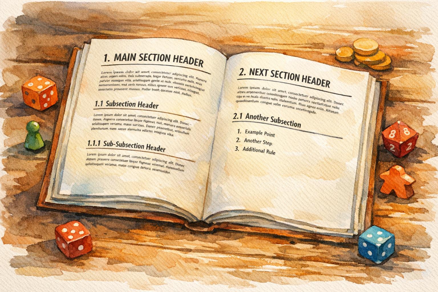
- Number sections: A numbering system (e.g., 1.0, 1.1) makes navigation easier and helps players reference rules quickly.
- Maintain consistency: Align headers uniformly, keep spacing predictable, and use the same capitalization style throughout.
- Test with players: Playtesting reveals if headers guide users effectively. Adjust based on feedback to improve usability.
A well-structured rulebook prioritizes clarity and usability, letting players focus on the game instead of the manual.
6-Step Process for Formatting Game Rulebook Headers
Laying out a Rulebook in InDesign [Witching Hour]
sbb-itb-7b84150
Selecting Header Fonts and Styles
Headers should capture your game’s personality while remaining easy to read. Christina Major describes the goal as creating an “invisible experience” - where typography is so intuitive that players absorb the information effortlessly. This means striking a balance between thematic appeal and functional clarity. Adjust font sizes thoughtfully to establish a clear header hierarchy.
Choosing Fonts That Balance Theme and Readability
Start by selecting a body text font (typically 10–12 points) and pair it with contrasting header fonts. For example, combine a serif body font with a sans serif header, or vice versa. Main headlines can be decorative to grab attention and reflect your game’s theme, but subheadings should prioritize functionality and avoid overly stylized fonts.
Functional text like numbers and letters needs to be the easiest to read, while headers can afford to be slightly more thematic, as they aren’t required for constant gameplay. To ensure readability, test your fonts using sample printed grids. Before finalizing, confirm that your chosen fonts are licensed for commercial use in PDFs. Open-license options, such as those from Google Fonts, are a great choice for hobbyists looking to avoid complex licensing fees.
These considerations ensure players can easily access critical game rules.
Setting Font Sizes to Create Visual Hierarchy
Use small font size increments to establish a clear visual hierarchy. For instance, moving from 12-point body text to a 13-point header creates enough contrast to distinguish the two. Stick to three levels of headings (H1, H2, H3) to maintain clarity and avoid overwhelming readers.
Take advantage of software “Styles” in tools like Word or InDesign to define header sizes consistently. For example, you might use 16-point bold for main sections and 12-point bold for subsections. A quick “squint test” can help identify which elements stand out. If your font’s bold style is particularly heavy, consider reducing its size slightly to maintain emphasis without making it overly dark.
Once sizes are set, apply consistent styles to differentiate header levels effectively.
Adding Bold, Italics, and Color
Bold is the go-to style for headers, offering stronger contrast and better legibility than italics. As Matthew Butterick explains, “Use bold, not italic. For headings, bold is easier to read than italic and stands out better on the page”. Save italics for secondary elements like notes or flavor text.
Color can also help distinguish subheadings or emphasize unique rules. Use subtle changes in color or typestyle to prevent subheadings from blending into main headlines. Avoid underlining in headers - it often adds unnecessary clutter. Finally, make use of white space to enhance the clarity and impact of your headers.
Creating a Logical Header Structure
A clear and logical header structure is essential for guiding players through your rulebook. Think of it as a roadmap that mirrors the flow of the game itself: setup, gameplay mechanics, and reference sections. Chris Wray, a respected author and game reviewer, stresses the importance of this organization:
“Where you say something can be just as important as what you say and how you say it. Many (if not most) BGG threads end with somebody pointing to the relevant part of the rulebook, but the confusion arises in the first place because somebody just couldn’t find the answer.”
Your header hierarchy should clearly illustrate how various rules are connected. Primary headers (H1) define the main chapters, such as “Gameplay” or “Setup.” Secondary headers (H2) break these chapters into specific topics like “Movement” or “Combat.” Meanwhile, tertiary headers (H3) provide detailed explanations within those topics, making it easy for players to scan and find the exact information they need. Once your structure is in place, you can add header levels and numbering to further refine the organization.
Setting Up Primary, Secondary, and Tertiary Headers
To create a clear hierarchy, define three levels of headers using your software’s “Styles” function. Game designer Gary Chavez shares his practical approach:
“For my Saints and Scoundrels game, I decided to use 16 point bold font for the sections, 12 point bold font for the subsections, and 10 point font for the regular text.”
This visual contrast helps players easily distinguish between major sections and their supporting details.
Structure your rulebook to follow the player’s journey through the game. Start with a thematic introduction and a list of components. Then move on to setup instructions, turn structure, gameplay mechanics, and endgame conditions. Wrap up with appendices or FAQs. Group related rules together to minimize page-flipping. For example, all combat mechanics - like melee attacks, ranged attacks, and damage resolution - should be grouped under a single “Combat” section instead of being scattered across multiple chapters.
Each header should be followed by a brief explanation of what the section covers. If you create one subsection (e.g., 2.1), ensure there’s at least a second one (2.2) to maintain balance. Once your header structure is set, use numbering to make the rulebook even easier to navigate.
Adding Numbers for Easy Reference
Numbered headers turn your rulebook into a powerful reference tool that players can quickly consult during gameplay. Use a multilevel decimal system - 1.0 for main sections, 1.1 for subsections, and 1.1.1 for detailed points. Each number should reflect its place in the hierarchy. Pair these numbers with clear titles, such as “3.1. Communication”, rather than vague labels like “3.1.”
Stick with Arabic numerals (1, 2, 3) instead of Roman numerals or letters, which can become confusing as the document grows. Owen K.C. Stephens, an RPG writer and publisher, highlights the benefit of this approach:
“It’s much easier to say ‘This uses the standard rules for bull rush, as found in the Combat Maneuvers section of the Tactical Rules chapter’ than to say ‘This uses the standard rules for bull rush, as found halfway down page 942, on the left, at the top of the really big paragraph.’”
Keep numbering simple by limiting it to three or four levels to avoid overwhelming players. Use your word processor’s “Multilevel List” feature to automate numbering, ensuring consistency throughout the document. Format numbers with a period and a single space before the title (e.g., “2.4. Card Actions”) and maintain the same style for all headers at the same level. This approach not only improves readability but also makes generating a table of contents effortless.
Maintaining Consistent Formatting
Once you’ve established your header hierarchy, maintaining consistent formatting is key to creating a user-friendly rulebook. Uniform formatting transforms your document into a professional and easily navigable reference. Headers serve as visual markers, helping players quickly locate the information they need without having to read every word. When headers follow a consistent pattern throughout, readers develop an intuitive understanding of where to find specific details.
Consistency also minimizes frustration, as noted by Owen K.C. Stephens. He points out that using the same header structure across similar sections - like identical headers for different character classes or kingdoms - makes it easier for readers to absorb information and reduces errors in repetitive sections.
Beyond improving readability, proper header formatting also enhances accessibility and professional presentation. Coded headers allow screen readers to navigate the document more effectively. They also help layout designers maintain a clear and structured layout. Tricorn Games highlights this point, emphasizing that clarity and organization outweigh stylistic elegance:
“A stilted, awkward rulebook with poor consistency between sections that is still clear, organized, and unambiguous serves its purpose far better than the most elegant prose that contradicts itself or leaves out important information entirely”.
Standardizing Alignment, Spacing, and Capitalization
Choose a capitalization style and stick with it. You have two main options: Title Case (e.g., “Combat Maneuvers and Special Attacks”) or Sentence case (e.g., “Combat maneuvers and special attacks”). While Microsoft recommends sentence case for better readability, APA style uses title case across all heading levels. Either approach works, but mixing them within the same document will confuse readers.
For alignment, it’s best to follow a consistent pattern for each header level. For example, you might center your Level 1 headers (chapter titles) while aligning Level 2 and Level 3 headers to the left. Similarly, maintain consistent spacing around headers. Use more vertical space above a header than below it to visually connect the header with the content it introduces. This small adjustment helps readers understand that the header relates to the text below, not the section above.
Avoid placing two headers back-to-back without any text in between. If a section header is immediately followed by a subsection header, include a brief explanation or introductory sentence between them. This prevents your table of contents from looking cluttered and gives readers context before diving into the details. Using Styles in your word processor can simplify formatting and make it easy to update your table of contents.
Linking Headers to Your Table of Contents
Consistent visual structure pairs perfectly with a well-organized table of contents (TOC) to streamline navigation. Ensure your TOC mirrors the exact wording, capitalization, and hierarchy of your headers. The simplest way to achieve this is by using your software’s built-in heading styles.
Suzan Last, author of Technical Writing Essentials, explains why this approach is so effective:
“Using the Styles function in Word… allows you to auto-create a table of contents from the headings in your documents. These will automatically update as you revise your document and add sections, which will save you considerable time in the long run”.
When you make changes - such as adding new sections or editing header text - refreshing the TOC will instantly update page numbers and titles.
Before finalizing your rulebook, review your headers by checking the automatically generated table of contents. This step makes it easy to spot inconsistencies in capitalization or formatting. Ensure every header is descriptive, like “Movement Rules”, rather than generic labels like “Section 3.” As a final step before publishing, always update the TOC to reflect any manual changes that may not have synced automatically.
Testing and Improving Your Headers
Testing your headers in a practical setting helps confirm if they effectively guide players through your rulebook. Usability tests for games typically involve 6 to 12 playtesters, with each session lasting about 90 minutes. This sample size is enough to uncover usability issues in your header design. Here are some strategies to help you test and refine your headers.
Getting Feedback Through Playtesting
Playtesting sessions are a great way to uncover navigation problems. A standard 90-minute session includes a briefing, uninterrupted gameplay with a “think out loud” component, and concludes with interviews and a wrap-up. During the play phase, the “think out loud” protocol is particularly helpful. Ask players to verbalize their thoughts while searching for a specific rule. This approach highlights where header titles or placements cause confusion.
Instead of letting players explore aimlessly, create specific tasks for them, such as “Find the rules for exceeding encumbrance.” This method tests whether your sub-headers guide them efficiently to the right section. Player Research highlights the importance of this tactic:
“Usability testing is the most powerful tool in the toolbox for game design improvement”.
Blind playtesting is another effective way to assess your headers. E.P. from Skeleton Code Machine explains:
“The only real test, however, is allowing players to struggle through the rules on their own and watching them play your game incorrectly”.
By observing how players interact with your rulebook without your guidance, you can determine if the headers and instructions are clear enough for independent use.
Using White Space Around Headers
Once you’ve gathered initial feedback, focus on layout details like white space to improve navigation. Watch how players handle dense text during testing. If they seem overwhelmed or struggle to locate sections, consider increasing the white space around headers. The Microsoft Style Guide advises:
“If readers don’t read the headings, they probably won’t read the text that follows, either”.
Pay attention to whether players skip text while searching for headers. If they can’t find entry points quickly, adjust the vertical spacing around headers or enhance the visual hierarchy. Also, ensure headers at the same level follow a consistent structure - either all noun phrases or all imperative verbs - to make them easier to process.
Making Changes Based on User Feedback
Use the insights from playtesting to refine your header design and address players’ navigation needs. When presenting your rulebook prototype, stay impartial and avoid defending your design choices. Negative feedback is an opportunity to uncover the root cause of navigation problems. A helpful method is the “I Like, I Wish, What If” approach, which gathers concise and actionable feedback.
Ask testers what might confuse other players and offer alternative designs for comparison. This approach encourages honest feedback and reduces self-consciousness. As Rikke Friis Dam and Teo Yu Siang from the Interaction Design Foundation note:
“When you present people with alternatives, you allow them to compare the various prototypes and tell you what they liked and disliked about each version, so you will get more honest feedback”.
Look for recurring patterns across multiple sessions instead of reacting to one-off issues. Trends often point to structural flaws that need fixing. After several rounds of testing, ask specific follow-up questions like, “Were the rules easy to understand?” or “Was anything confusing?” to identify sections that need better formatting.
Conclusion
Your header design has the power to turn a rulebook into a user-friendly guide. By choosing the right fonts, creating a clear hierarchy, and thoroughly testing your headers, you can craft a rulebook that aligns seamlessly with your game’s flow.
Headers do more than just organize - they influence how players interact with your game. A well-thought-out visual hierarchy, consistent formatting, and descriptive titles can make your rulebook accessible to everyone: first-time players learning the ropes, experienced players looking for quick clarifications, and returning players refreshing their knowledge.
As Owen K.C. Stephens puts it:
“By giving a section of text a header, you make it easy for the reader to know what is coming, quickly find relevant material, and safely skip part of a chapter or article if they don’t need that information yet”.
The details of your formatting - like font sizes and spacing - play a big role in reducing mental strain and ensuring smooth gameplay. During the writing phase, headers help you stay organized and cover all essential sections, transforming dense text into a handy reference tool.
Playtesting is where the real test of your headers happens. Observe how players navigate the rulebook, note where they struggle, and tweak your headers to match their natural search habits. This iterative process ensures your rulebook supports the player experience, keeping the focus on the game rather than the manual.
FAQs
How can I pick fonts that match my game’s theme while staying easy to read?
Choosing the right fonts for your rulebook is all about striking a balance between style and readability. Start by considering the tone of your game. Is it a gritty sci-fi adventure, a whimsical fantasy, or a sleek modern strategy? The fonts you choose should reflect that theme. For instance, a distressed serif font might perfectly capture the mood of a post-apocalyptic game, while a clean sans-serif could complement a futuristic setting.
When it comes to body text, readability is key. Stick to fonts that remain clear and easy to read at smaller sizes, typically between 9–11 pt. To create a visual hierarchy, pair a highly readable body font with a more expressive header font. This not only helps organize information but also adds a touch of personality to your rulebook. Keep your font choices limited to two or three families, and use variations like bold or italic within the same family to emphasize important points without sacrificing consistency.
Steer clear of overly decorative fonts for body text - they’re better suited for titles or flavor text, where style can take precedence over clarity. Before finalizing your selection, test your fonts by creating sample pages at the intended size. This ensures your text remains easy to read, whether in print or digital formats. Lastly, always choose fonts from reputable sources to avoid licensing headaches and to guarantee professional quality.
How can I test if my headers help players navigate the rulebook?
The most effective way to make sure your headers guide players well is through blind playtesting. Hand a group of new players only the rulebook - no verbal instructions allowed - and observe how they interact with it. Ask them to locate specific sections, time how long it takes, and pay attention to any confusion or repeated questions. Comments like “I couldn’t find the combat rules” or “the setup steps were unclear” can reveal exactly where your headers might be falling short.
Another approach is to test with player aids. Create a cheat sheet based on your header structure and see if players can smoothly transition from using the cheat sheet to navigating the full rulebook. If they struggle, it might mean your headers need a clearer hierarchy, better wording, or more noticeable formatting. Keep tweaking until players can find what they need quickly and without frustration.
How do I ensure consistent header formatting in my game rulebook?
To keep your rulebook looking polished and professional, start by setting up a clear header hierarchy. Define levels like chapter titles, section headings, and subheadings, and assign each a distinct style. For example, you might use 18 pt bold for chapter titles and 14 pt bold for section headings. Use your word processor or layout software to create reusable styles, such as “Heading 1” and “Heading 2.” This not only ensures consistency but also makes it easy to generate a table of contents automatically.
Consider adding running headers to each page to help readers navigate. A common setup includes placing the book title on the left-hand (verso) page and the current chapter title on the right-hand (recto) page, with page numbers aligned to the outer margins. To keep these headers functional yet unobtrusive, use a font slightly smaller than the body text - something like 10 pt works well.
Lastly, compile these header rules into a style guide. This way, you’ll have a reference for maintaining consistency when editing or adding content. A style guide also helps verify that running headers are accurate and that alignment and spacing remain clean. By using a template-based approach, you’ll make sure your rulebook is easy to navigate and visually appealing for your audience.