Game Talk
How Non-Verbal Design Builds Player Connection
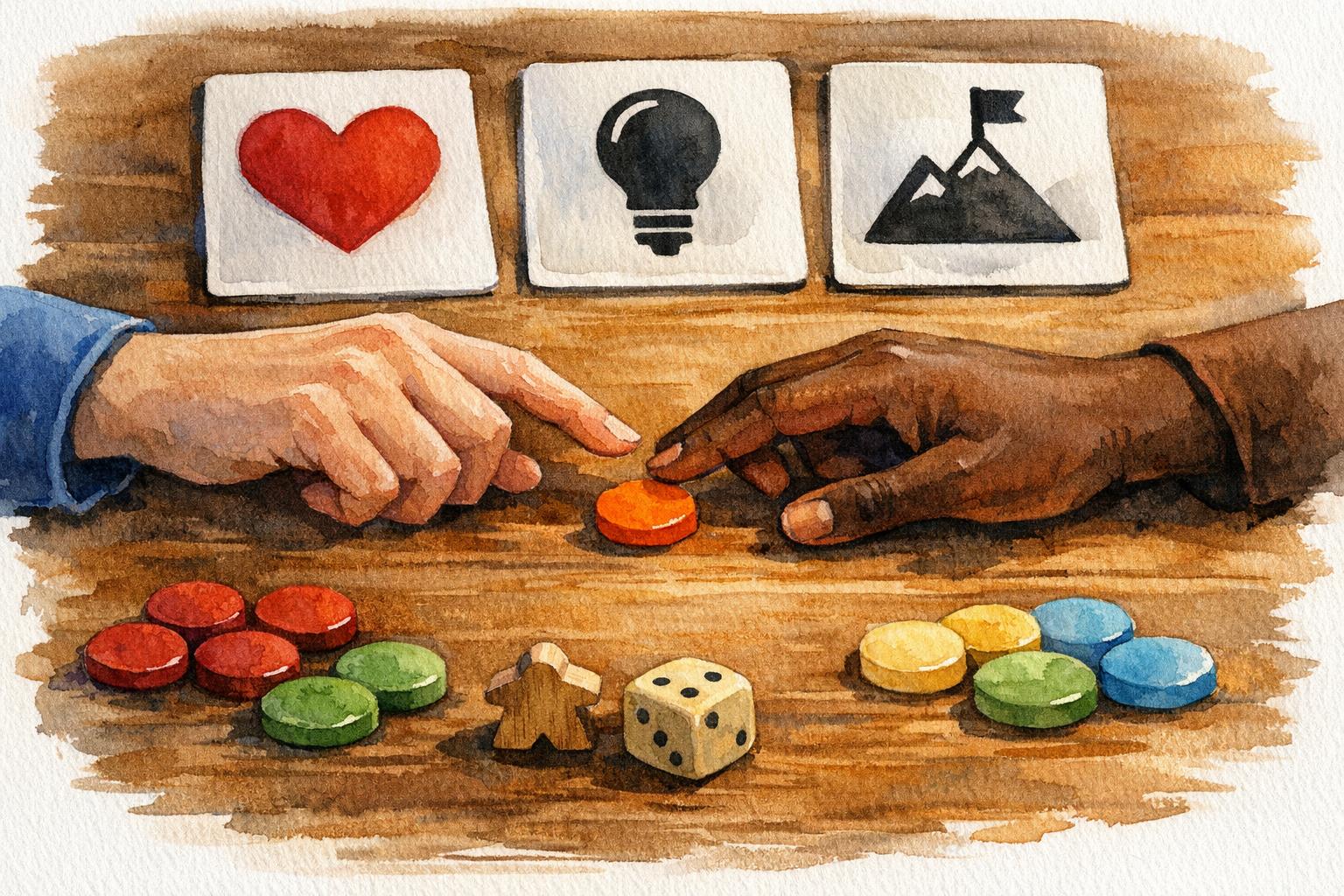
Non-verbal design in tabletop games uses visuals, symbols, and tactile elements to communicate game rules and create shared player experiences without relying on words. By focusing on iconography, colors, and physical components, this approach makes games easier to understand, faster to play, and accessible to diverse audiences. It also fosters emotional connections through collective moments like rolling dice or revealing cards.
Key Takeaways:
- Simplifies Gameplay: Players recognize game states quickly through visuals, reducing reliance on text.
- Inclusive Design: Icons, shapes, and tactile features break language barriers and aid players with impairments.
- Shared Experiences: Actions like card flips or dice rolls create collective tension and excitement.
- Challenges: Players may face a learning curve or misinterpret symbols, requiring thoughtful testing and iteration.
Designers can improve non-verbal communication by ensuring clarity, consistency, and accessibility in their visual and physical game elements. Observational playtesting and refining based on feedback are essential steps to success.
Graphic Design for Board Games by Daniel Solis
sbb-itb-7b84150
Why Non-Verbal Elements Build Player Connections
Verbal vs Non-Verbal Design in Tabletop Games Comparison
Non-verbal design transforms gameplay into a shared physical experience. Instead of relying on words, players communicate through actions like flipping cards, rolling dice, or moving pieces. These tactile interactions create what researchers call “embodied sensemaking”, where intentions are made clear through visible gestures rather than spoken language. For instance, when everyone watches a card reveal or a dice roll, they’re part of a collective moment that transcends words.
The emotional impact of these shared moments is undeniable. Think about the tension of rolling dice together or uncovering a mystery card - there’s a collective buildup that either leads to celebration or shared disappointment. A participant in a BBC R&D study described it perfectly:
“We were all waiting for the number to pop up and be revealed. Every time we lost we would all be quite disappointed and quite excited when it worked.”
- BBC R&D Study
These synchronized highs and lows forge immediate connections among players, as everyone experiences the same emotional peaks at the same time.
Non-verbal design also breaks down language barriers, making games more inclusive. By using icons and symbols instead of text, games can reach international audiences and players who speak different languages. For players who are visually impaired, tactile features like uniquely shaped tokens provide autonomy, which is especially crucial since only about 10% of the legally blind population reads Braille. High-contrast color palettes, designed to meet WCAG guidelines, further enhance accessibility, ensuring players with visual impairments can easily distinguish game elements.
Michael Heron from Meeple Like Us captures the essence of this approach:
“Accessibility is about removing the barriers that stop people playing. Those barriers are sometimes physical, sometimes philosophical, sometimes economic, and sometimes in terms of inclusiveness of representation.”
- Michael Heron, Meeple Like Us
Non-verbal tools like emotion tokens or strategy cards also allow players to express preferences - like signaling “I need help” or “I want to play independently” - without the need for difficult conversations. This structured form of communication is especially useful for players with social anxiety or other communication challenges, creating a safe space to engage and connect.
The Benefits of Non-Verbal Design
Non-verbal design isn’t just about inclusivity - it also enhances the overall gaming experience. Icon-based and tactile elements bring specific advantages:
- Faster gameplay: Once players learn a game’s visual language, they can quickly scan the board and understand the game state without reading lengthy text. Pattern recognition kicks in faster than reading, allowing players to focus on strategy.
- Universal accessibility: By removing literacy requirements, non-verbal design welcomes players with cognitive impairments or lower reading levels. Clear visual landmarks and grid references also help players with motor impairments direct others to execute moves, preserving their strategic input.
As BBC R&D researchers observed, the game board becomes:
“the central shared space between the players that summarises their current and past actions… the ultimate representation of the group’s collaboration and what connects them.”
- BBC R&D Study
The tactile nature of board games - shuffling cards, rolling dice, moving tokens - makes the experience feel more tangible than digital alternatives. Emily Bradshaw from Asmodee highlights this:
“The physicality of moving pieces across a board feels more ‘real’ and satisfying than digital environments.”
- Emily Bradshaw, Asmodee
This physical engagement brings a sense of intentionality. Each move is deliberate and visible to everyone, eliminating the need for constant verbal updates. However, while non-verbal design offers these strengths, it also comes with its own set of challenges.
The Challenges of Non-Verbal Design
Non-verbal design isn’t without its difficulties. One of the biggest hurdles is the learning curve. Unlike reading familiar text, interpreting icons requires players to learn a new visual language, which can initially feel overwhelming.
Another issue is misinterpretation. Icons that seem obvious to the designer might confuse players from different cultural backgrounds or those unfamiliar with gaming conventions. Without thorough testing, symbols intended to clarify gameplay might actually complicate it.
There’s also a trade-off in precision. Text is better for explaining complex rules or niche scenarios, while icons work best for simpler concepts. Trying to convey intricate details through symbols alone can lead to cluttered designs. To bridge this gap, players often need reference sheets or legend cards, which can disrupt the flow of the game as they pause to check meanings.
Comparison Table: Verbal vs. Non-Verbal Design
Feature
Text Design
Icon Design
Learning Curve
Lower initially (if language is known)
Higher (requires learning a visual language)
Gameplay Speed
Slower (requires reading and processing)
Faster (once icons are memorized)
Accessibility
Low (barriers for literacy, vision, language)
High (supports universal design and inclusivity)
Language Barriers
High barrier for non-native speakers
Universal; bypasses language requirements
Immersion
Can be broken by dense “wall of text”
Enhanced through thematic art and symbols
Precision
High; can explain complex, niche rules clearly
Moderate; can be ambiguous if icons aren’t intuitive
Examples
Tales of the Arabian Nights (text-heavy)
Splendor, 7 Wonders (icon-heavy)
Non-verbal design offers a lot of potential, but balancing its strengths with its challenges is key to creating an engaging, accessible game.
Design Principles for Non-Verbal Communication
When creating non-verbal elements in a game, the goal is to ensure clarity and consistency. These elements should form a visual language that players can quickly grasp while staying connected to the game’s world. Attila Kerek, Graphic Designer at Mindclash Games, puts it perfectly:
“Iconography builds a bridge between the player and the game. Symbols are designed to convey information as quickly and intuitively as possible.”
- Attila Kerek, Mindclash Games
This means treating icons, colors, and components as a system of communication, not just decorative elements. Every piece should work together to make understanding the game state effortless.
Iconography and Symbolism
Icons act as the “words” of your game’s visual language. Start with simple, recognizable symbols that reflect real-world objects - like a shield for defense or a coin for money. When mechanics get more complex, combine these basic symbols into compound icons. For instance, Hanamikoji uses checkmarks and crosses alongside card counts to clearly show how many cards are scored versus discarded.
The arrangement of icons matters just as much as the icons themselves. Group related elements closely to show their connection (using the Proximity Law), and use contrasting symbols to highlight opposing effects. Paranormal Detectives does this effectively with its ghost meter, which features contrasting adjectives at each end.
Bold, simple icons are key. While detailed illustrations might look great, they often lose clarity when scaled down for cards or tokens. For more complex sequences that can’t be simplified into a single icon, use diagrams instead. As Daniel Solis explains, “If iconography are the words of visual language, diagrams are complete statements”.
From here, color and shape can further enhance the communication power of your designs.
Color and Shape as Communication Tools
Colors naturally carry certain associations: red often signals danger or costs, green suggests growth or approval, yellow draws attention, and blue is linked to science or technology. However, don’t rely solely on color. The redundancy principle emphasizes pairing colors with distinct shapes or icons to accommodate colorblind players.
Shapes also communicate on a subconscious level. Horizontal lines feel stable and calm, while diagonal lines suggest movement and tension. Sharp points evoke danger, whereas curves convey safety and natural forms. Even the orientation of a triangle can change its meaning - upright, it feels strong and grounded; upside down, it feels unstable and precarious.
Consistency is critical. If purple hexagons represent “energy” in one part of your game, they should mean the same thing throughout. This consistency helps players learn your system with less effort. Brass Lancashire is a great example, using vibrant, high-contrast tokens on a dark Industrial Revolution-themed board. The design stays true to the theme while keeping functional elements easy to spot.
Component Design for Clarity
Physical components go beyond aesthetics - they also communicate meaning through their form, texture, and placement. For example, tokens with different shapes or textures, like coins with varied sizes or edges, allow players to distinguish pieces by touch. This is especially helpful for visually impaired players.
Strategic placement of components can streamline gameplay. Race for the Galaxy places all functional icons along the left edge of its cards, enabling players to fan their hand and quickly compare bonuses across multiple cards. This simple design choice saves time and reduces frustration. When designing for busy backgrounds, ensure text and icons meet a minimum contrast ratio of 4.5:1 for normal-sized text or 3:1 for larger text (14 points or more).
Anachrony provides a clever example of adding meaning without clutter. It uses standard resource icons but overlays them with a “black hole” symbol to indicate costs. This allows players to instantly distinguish between rewards and payments without needing to read text. To further ease learning, include reference cards so players don’t have to memorize every symbol - this keeps the game accessible while retaining the speed advantages of icon-heavy design.
How to Add Non-Verbal Cues to Your Game
Brainstorming Non-Verbal Mechanics
Think of the board as a shared space that reflects past moves, current actions, and potential future strategies. This setup highlights the contrast between private information held by players and the public information visible to everyone. By doing so, players can interpret the game state without needing constant verbal updates.
Player actions can also serve as a way to communicate intent visually. To push this further, consider adding constraints like silent phases, where players are restricted from discussing strategies verbally. This encourages reliance on non-verbal cues. After all, studies show that a staggering 93% of communication happens through gestures, expressions, and other non-verbal means.
Prototyping and Refining Designs
Once you’ve brainstormed your ideas, start small. Create a prototype with just 10–20 cards rather than a full set to see if your core non-verbal mechanics work as planned. Observational playtesting is key here. Instead of relying solely on post-game surveys, watch how players interact during the game itself. As John Brieger, a Boardgame Developer at Brieger Creative, puts it:
“The experience of your game happens during the game, so it’s silly to only measure and record data afterwards” - John Brieger, Brieger Creative
Since the game unfolds in real-time, it’s crucial to measure and adapt based on what happens during gameplay.
Pay close attention to moments when players seem highly engaged (local maxima) or visibly frustrated (local minima). If players hesitate or repeatedly consult a rule aid, these moments likely highlight areas where your non-verbal design needs adjustment. Blind playtesting - where you provide players with the prototype and rules but remain silent - can also uncover whether certain icons or layouts fail to communicate effectively.
Iterating Based on Feedback
Player feedback isn’t just about what they say - it’s also about what they do. Watch for physical cues like leaning back, looking away, or frowning. Encourage testers to use “I” statements (e.g., “I felt unsure about this symbol”) to narrow down specific areas of confusion.
If a particular non-verbal element repeatedly causes confusion across different playtest groups, it’s a clear sign that it needs reworking. Jamey Stegmaier, Founder of Stonemaier Games, offers this advice:
“Every question playtesters ask about the rules is important, even if the answer is in the rules - that’s an opportunity to highlight it better or say it more clearly” - Jamey Stegmaier, Stonemaier Games
To stay on track, schedule playtests in advance. This helps maintain momentum and keeps you moving forward creatively. With each iteration, refine your visual language to ensure it aligns with the experience you want players to have. This step-by-step process is essential for weaving non-verbal cues seamlessly into your game’s overall design.
Case Study: Visual Storytelling in ‘Red Tape’ by MINIFINITI
MINIFINITI’s Red Tape showcases how clear iconography and thoughtful component placement can immerse players in a satirical political world. Using 100 distinct cards, the game builds an instantly recognizable setting through bold visuals, unique designs, clever names, and quirky historical captions. These elements work together to create an engaging experience that feels both familiar and fresh for players.
The game’s reverse engine builder mechanic leans heavily on non-verbal cues. For instance, drawing a Department card halts a player’s turn and initiates a silent, facedown bidding phase. This mechanic ramps up tension as players quietly assess each other’s strategies. Unlike traditional engine-building games, where players focus on growing their own power, Red Tape flips the concept on its head. Players actively disrupt their opponents by introducing bureaucratic gridlock through Department cards. This streamlined design ensures players are drawn into the gameplay without the need for lengthy explanations.
“Red Tape turns the classic engine-building concept upside down. Instead of constructing a powerful engine, you’ll delight in dismantling and disrupting your opponents’ plans.” - MINIFINITI
The game’s simplicity shines through its fast learning curve - players can grasp the rules in just two minutes. Each card is designed to communicate its purpose visually: Senators act as bidding currency, Department cards symbolize bureaucratic obstacles, and red tape physically limits opponents’ actions. The win condition is also communicated without words - when players can no longer play Policy cards due to accumulated restrictions, the game ends.
Red Tape demonstrates how non-verbal cues can foster player engagement and connection. By blending humor with strategic mechanics, the game creates a shared experience of political chaos. Snarky card names and intuitive visuals eliminate the need for excessive explanation, making it accessible across language barriers. Through its clever use of components and design, Red Tape keeps players focused on the action, proving that effective visual storytelling can unite players in both strategy and laughter.
Conclusion: Building Player Connections Through Non-Verbal Design
Non-verbal design establishes a shared visual language that brings players together without the need for words. By combining colors with distinct symbols, incorporating tactile elements, and ensuring critical information is always easy to access, designers can create games that accommodate a wide range of player needs. This approach also helps overcome language barriers, promoting a sense of universal understanding.
But it’s not just about accessibility - non-verbal design also deepens the game’s thematic experience. These cues help maintain immersion by minimizing out-of-character conversations that could disrupt the game’s fictional world. Tactile elements further reduce mental strain, allowing players to quickly assess the game state without constant rulebook checks or tedious calculations. This efficiency keeps the focus on strategy and social interaction, rather than on navigating unnecessary complexity.
Some practical tips to enhance non-verbal design include:
- Pair colors with unique shapes or icons to support colorblind players.
- Keep information within easy reach so players don’t have to search for critical details.
- Use thicker components, which are easier to handle for players with limited dexterity.
The importance of these design choices is backed by market trends. For example, the US hobby game market hit $880 million in 2014, with board games contributing nearly $200 million to that growth. This growth highlights how intuitive design not only fosters trust and reduces negativity but also creates shared experiences that resonate with players. Physical actions within games can express emotions in ways that words often cannot.
To put these principles into practice, test your prototypes with diverse groups of players. Pay attention to moments of confusion and observe how players naturally develop non-verbal shortcuts. Fine-tune your icons and components until they effortlessly communicate their purpose. When done well, non-verbal design transforms games into unforgettable experiences, connecting players through intuitive and inclusive gameplay that goes beyond words.
FAQs
How do I know when an icon needs text?
Icons should include accompanying text when their meaning isn’t instantly obvious or risks being misunderstood. Adding text clarifies their purpose, ensuring players grasp their intent without confusion. This becomes particularly crucial when icons depict abstract ideas or actions.
How can I make icons clear across cultures?
Icons should be simple, easy to understand, and recognizable no matter where someone is from. Choose symbols that represent objects or ideas without needing words, and steer clear of anything too complicated or unclear. This makes it easier for players to grasp their meaning and ensures a more welcoming experience for everyone.
What’s the best way to playtest non-verbal cues?
The most effective method is observational playtesting - watching how players engage with non-verbal elements in your game. Pay attention to their reactions, any confusion, or moments when they clearly connect with the design. Before starting, define specific goals for the session, like pinpointing areas that spark joy or cause uncertainty. Afterward, ask players open-ended questions about their experience with the non-verbal interactions to gather honest feedback. Creating a comfortable environment for sharing ensures you can fine-tune these cues for better clarity and impact.